Branding a Five-Star Wellness Resort: Mani Ratna, Hongtsho
From a wish-fulfilling jewel to a full brand system and website
Bharat Thapa
Author
Client: Mani Ratna Resort Location: Hongtsho, Thimphu Project Type: Brand Identity, Collateral & Website Status: Live at www.maniratnaresort.bt
A five-star wellness resort does not sell rooms. It sells a feeling that starts long before a guest arrives — in a logo on a booking page, in the weight of a welcome card, in whether the website looks like somewhere worth flying for. Mani Ratna asked us to build that from the beginning.
The client
Mani Ratna Resort sits in the forests above Hongtsho, about thirty minutes from Thimphu — close enough to reach easily, far enough to be genuinely quiet. Step outside a room and you are between the Tashigang Lhakhang and the views of Dochula Pass.
The positioning was clear from the first conversation: a luxury wellness resort rooted in Gross National Happiness, blending holistic wellbeing, nature and mindful living in harmony with Bhutan’s high-value, low-impact tourism philosophy. Limited rooms. Low environmental footprint. Personal, unhurried service.
That is a specific promise, and it needed a brand that could carry it without shouting.
Starting with the name
“Mani Ratna” is Sanskrit for jewel, or precious gem — in Buddhist usage, the wish-fulfilling jewel. It was already the right name, and that mattered: it gave us a symbol to build everything else around.
We anchored the identity on four things the name already does. It signals preciousness and value, appropriate to a high-end property. It carries spiritual significance rooted in Bhutan’s Buddhist heritage and GNH. It is phonetically smooth and memorable, which a premium brand needs. And it is timeless rather than trend-bound — a name from ancient wisdom does not date.
Auditing what was there
The resort came to us with an existing logo: a golden-yellow geometric mark above a bold wordmark. We started by saying plainly what worked and what did not.
What worked was the instinct. The design was symbolic and culturally grounded, the golden yellow read as luxury and warmth, and the composition was symmetrical and clean.
What did not work was the execution. The typeface was bold but generic, lacking the elegance luxury and wellness branding depends on. The geometric detail turned to mud at small sizes — a real problem for a business that lives on booking platforms and phone screens. And a single-colour mark gave the resort nowhere to go across the range of backgrounds a hotel actually needs.
Keeping the instinct and rebuilding the execution became the brief.
The logo
We developed three directions, each pairing Bhutanese symbolism with a different tone.
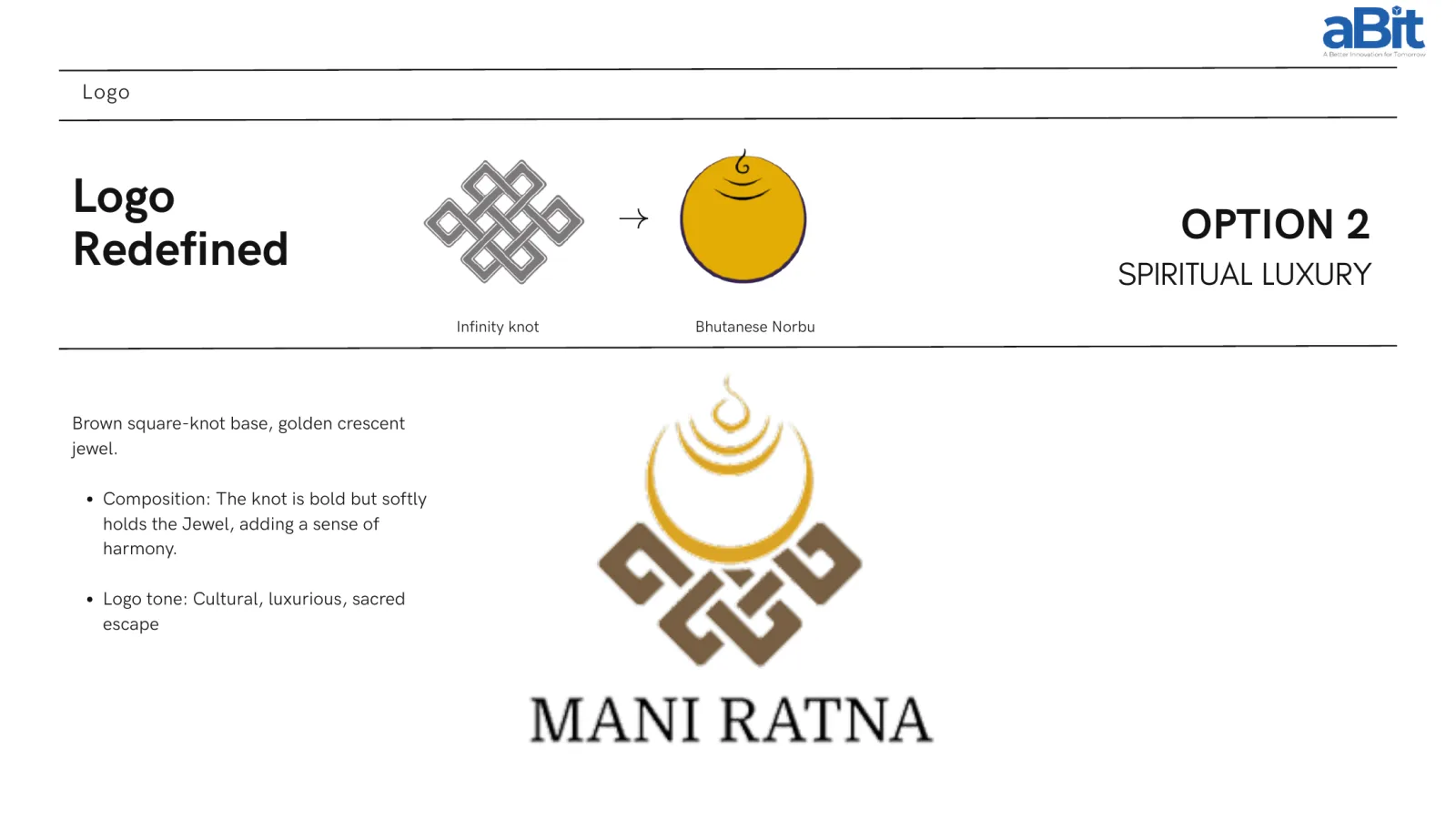
Elegant Heritage Twist put a soft olive-green infinity knot beneath a golden-yellow Norbu jewel — nature-oriented, spiritual, a timeless retreat. Spiritual Luxury set a brown square-knot base beneath a golden crescent jewel, the knot holding the jewel with a sense of harmony — cultural, luxurious, a sacred escape. Modern Minimalism compacted the knot to a symmetrical mark with the jewel on a clean vertical axis — a contemporary, wellness-focused read.
All three drew on the same two elements: the endless knot and the Bhutanese Norbu. The resort chose Spiritual Luxury, and it is the mark on the building and the website today.
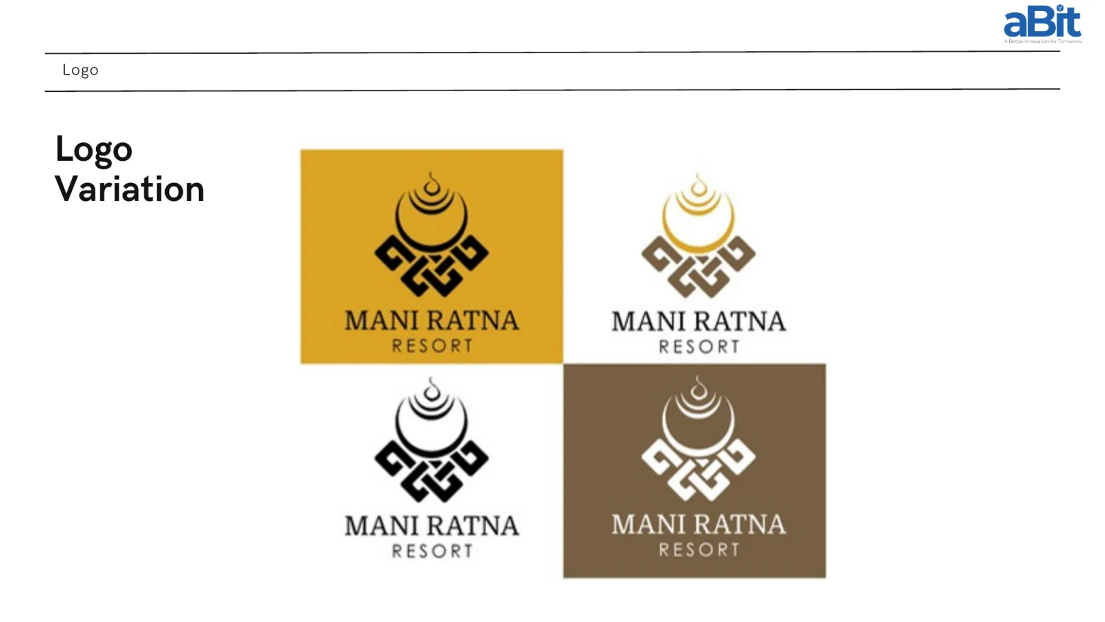
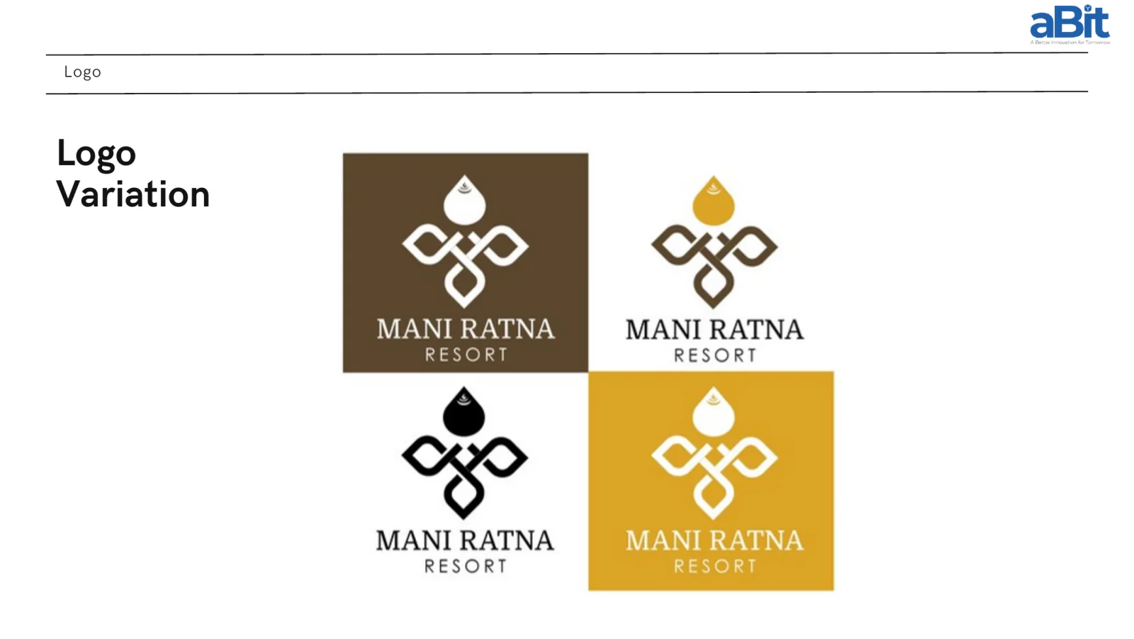
Because the original logo’s biggest practical failure was versatility, we built the variations out properly — the mark on white, on gold, on brown, and in single-colour black, so it holds up on a signboard, an embroidered robe, a booking platform thumbnail and a printed menu without anyone having to improvise.
The system
Colour. The palette comes from the setting rather than from a trend: Golden Yellow #dba425 for the jewel and the moments that should feel precious, Japandi Green #5f633b from the forest, and a grounding set of Black #131313, Light Brown #775f43 and Dark Brown #5b472e, with softer neutrals for backgrounds and print.
Typography. MANI RATNA is set in Domine, uppercase — a serif that reads bold, trustworthy and timeless, with enough heritage in the letterforms to sit beside the knot. RESORT is set in Levenim MT with the tracking opened up: clean, minimal, and a deliberate contrast that keeps the lockup from feeling heavy.
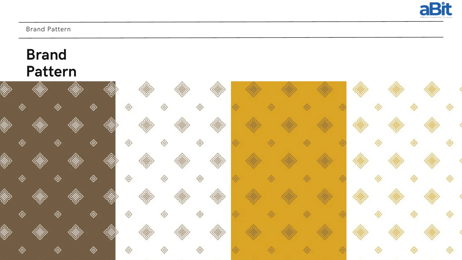
Pattern. The knot motif becomes a repeating pattern in brown, gold and neutral. This is the piece that does the quiet work — it lets everything from an envelope to a door hanger read as Mani Ratna without the logo having to appear on all of it.
Personality and voice. Serene, authentic, nurturing, luxurious, harmonious. Calm, inviting, respectful, knowledgeable — subtly luxurious rather than loudly so, and deliberately avoiding the trendy, aggressive language most hospitality marketing defaults to.
Where a hotel brand actually lives
For a resort, the identity is not a logo file. It is roughly a hundred small objects a guest touches over three days. We designed the system out across them:
Stationery — business cards, letterhead and envelopes, patterned and ready to print.
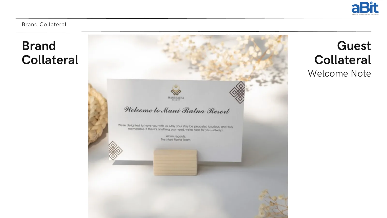
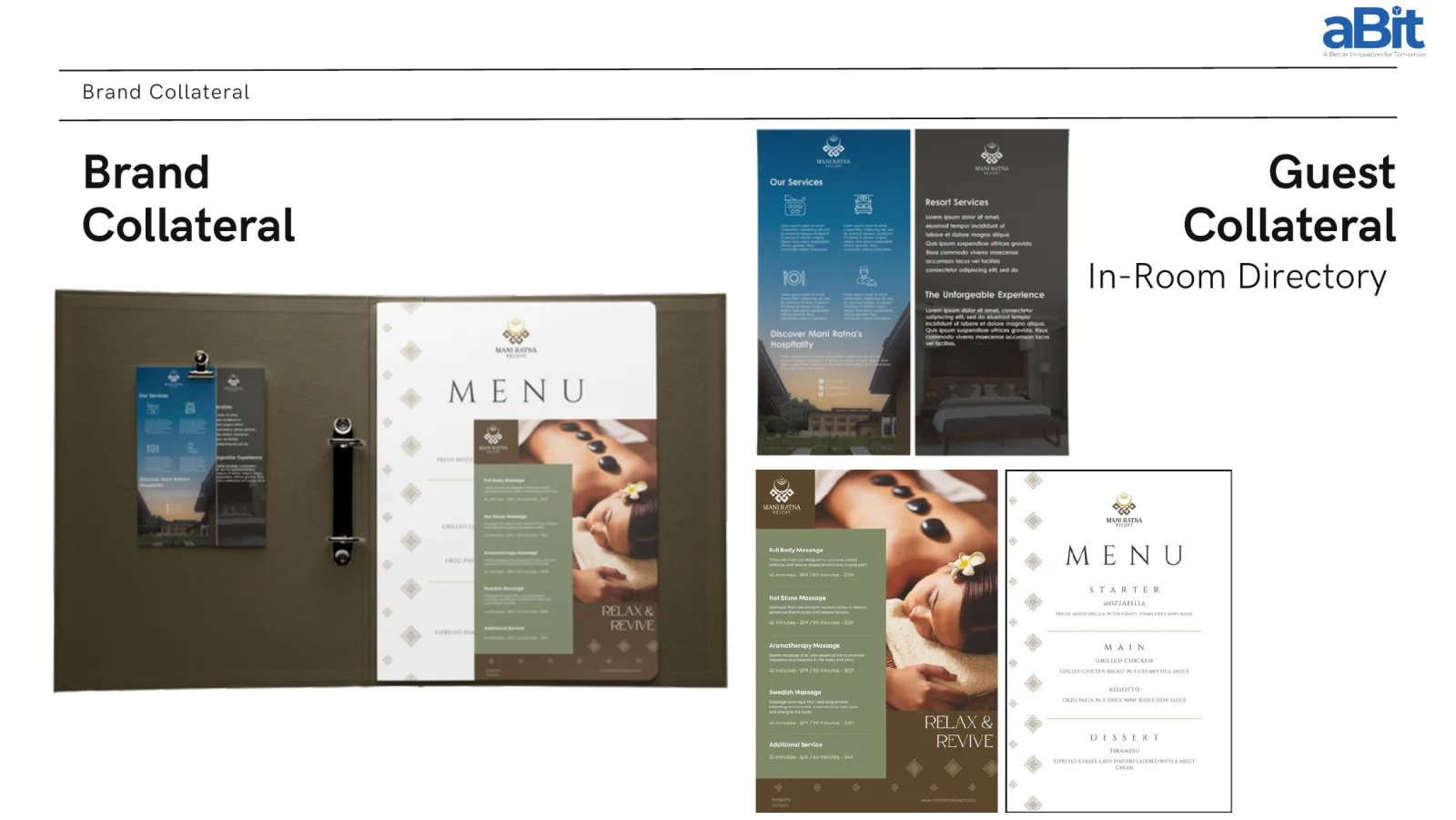
Guest collateral — the welcome note on the bed, door hangers, luggage tags, and the in-room directory carrying services, spa menu and dining.
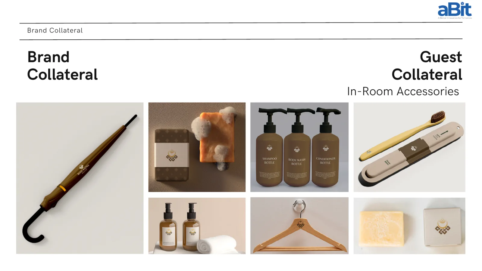
In-room — robes, towels, slippers and eye masks carrying the mark; soap, shampoo and body wash, toothbrush and hangers in the brand’s browns and golds.
Spa amenities — a restrained, near-white treatment for the wellness line, where the brand steps back and lets the products feel clinical and calm.
And then the website
This is the part that usually breaks. Branding ends at a logo file and a PDF of guidelines, someone else builds the website, and the brand you approved is not the brand that goes live.
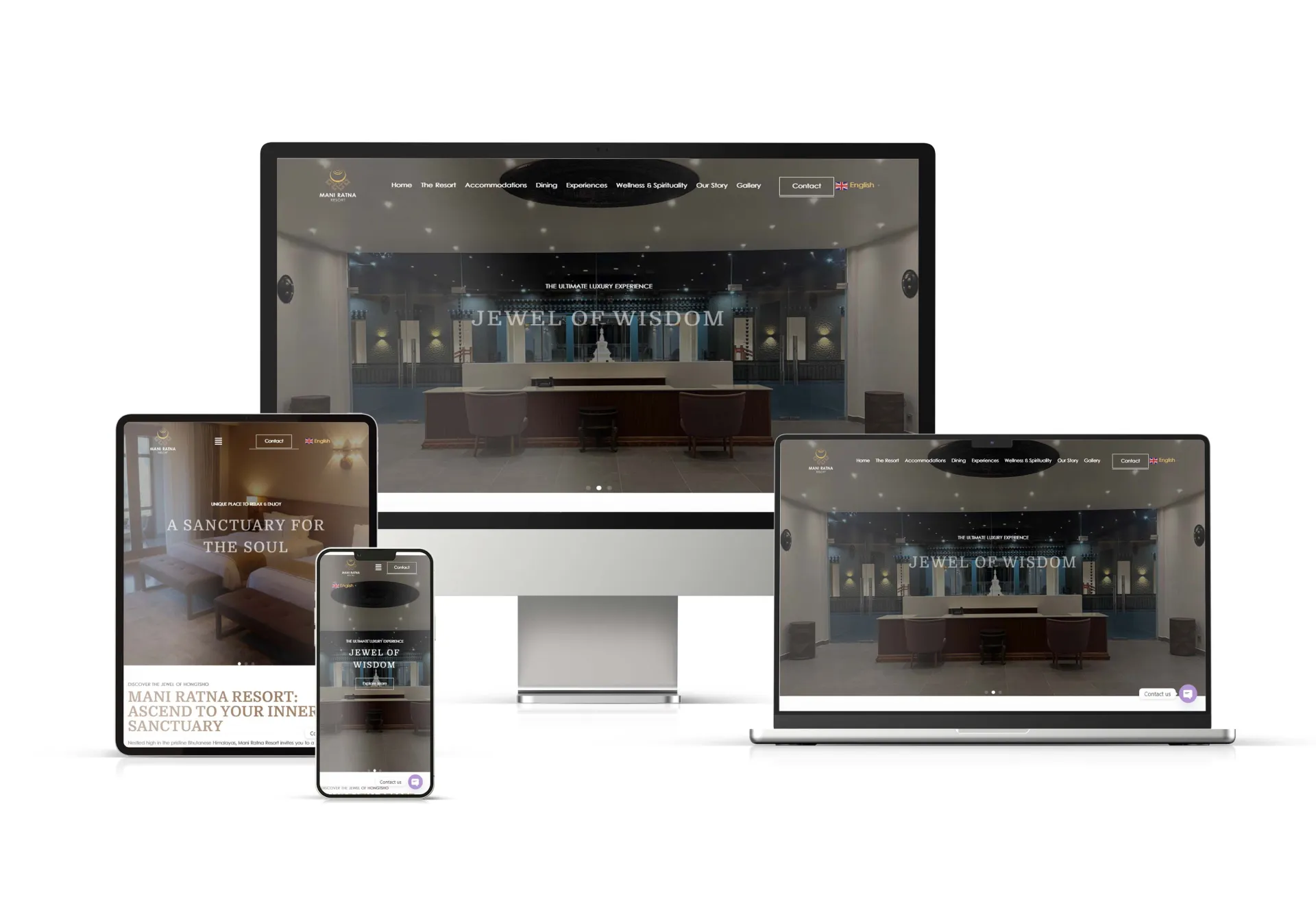
Here it was one engagement. The same team that designed the identity built www.maniratnaresort.bt in it — the mark in the header, Domine carrying the headings, the browns and golds running through the sections, and the structure built around what a guest actually comes for: the resort, accommodations, dining, experiences, wellness and spirituality, the story, the gallery, and a way to get in touch. It runs in English for the international audience the resort is built to reach.
The result is that a guest who finds the resort on a phone in Singapore and a guest who walks into the lobby in Hongtsho meet the same brand.
Why it matters
Bhutan’s tourism policy is high-value and low-impact by design. That model only works if the value is legible — if a property can communicate what makes it worth the visit before anyone arrives. For a resort with limited rooms and a deliberately small footprint, brand is not decoration. It is how the business explains itself to the world.
Thank you
Our thanks to Mani Ratna Resort for trusting us with the whole of it — the name’s meaning, the mark, the objects in the room, and the website that carries them. Projects where the brand and the build stay in one place are the ones we are proudest of.
aBit Private Limited builds brands and the digital systems that carry them — logo and identity, websites, social presence, and print. See our Branding & Digital Marketing and Website Development solutions, or talk to us.